Case study - NRJx - 2024
Making energy data tell you what to do
Turning a BI dashboard into an actionable graph for factory teams who aren't energy experts, and don't want to become them.
In short: NRJx watches a factory's energy data and flags where it's drifting. The raw material was a classic BI dashboard: lots of curves, no answer to the only question that matters: is there a problem, and if so, am I making or losing money? We designed around that question: every reading anchored to a standard, deviations as the main object, and a single view a generalist could read at a glance and an energy specialist could drill into. In testing it worked cleanly. The useful surprise was that the non-experts, given the full depth, chose to explore it instead of staying at the surface and freezing. I left before it shipped, but it's the backbone of what NRJx sells today.
Context
NRJx is an AI energy-supervision platform for industrial sites, built to be usable without energy expertise: it detects consumption deviations automatically so teams can cut waste without a specialist on staff. That "without expertise" part is the whole point, and the design constraint.
The problem
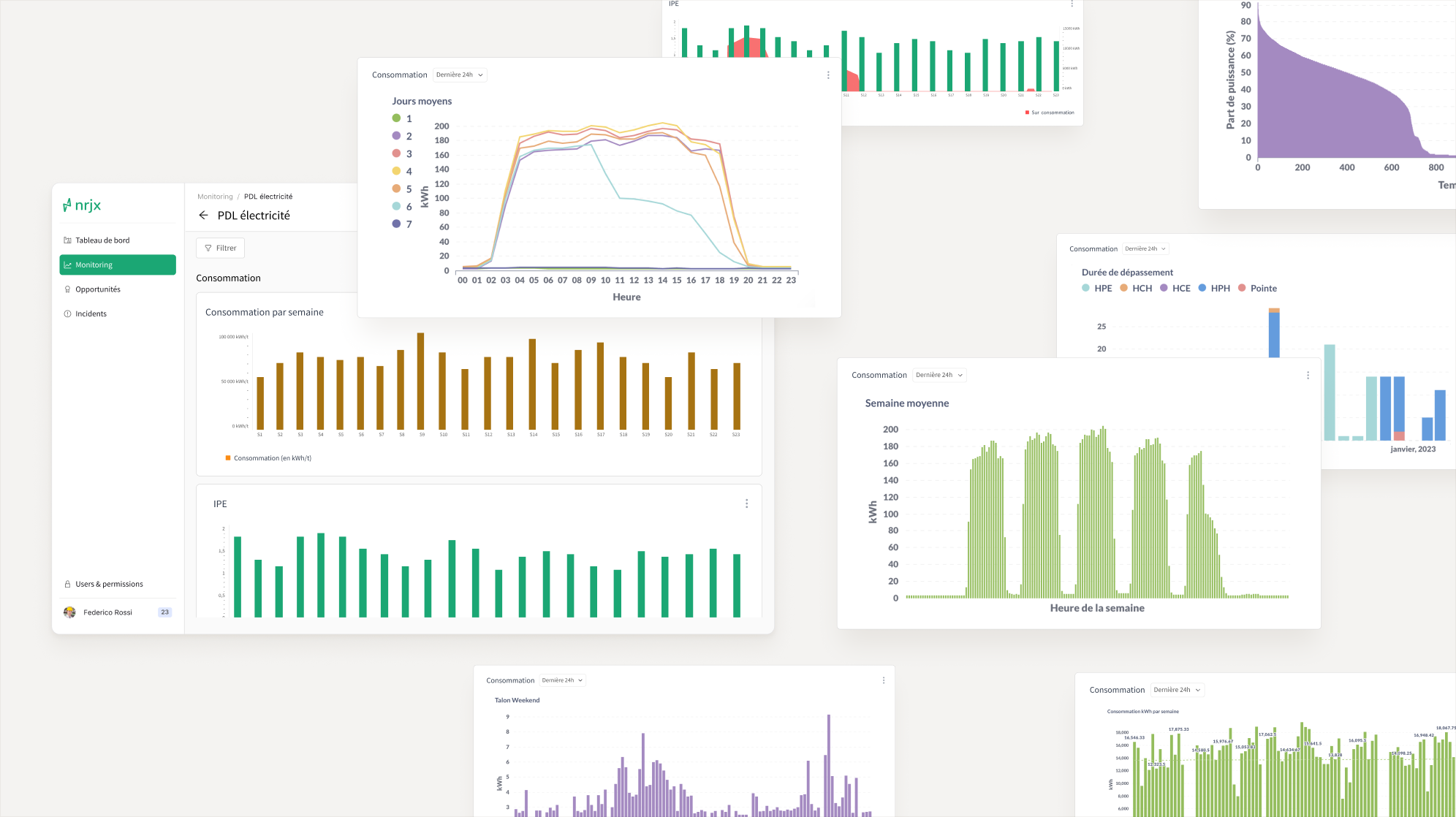
The starting point was a BI dashboard: real consumption plotted over time, sliced every way you could slice it. It was technically complete and practically useless. It threw information at people without telling them whether any of it was good or bad, or what to do about it.
The reframe the founders' research landed on, and the one thing everything else hangs off, was this: users don't care whether they consumed more or less. They care whether they're making or losing money. More kilowatt-hours isn't automatically bad, it depends on what you produced. So consumption only means something against a standard.
I could confirm this wasn't just a hypothesis because a separate, loosely related research track I was running surfaced the same signal from another angle: people didn't want to become energy analysts at all.
"NRJx does it for me, I don't want to do it."
"It's too big for my need."
"I don't have time to deal with it."
"We've no internal resource for this."
Same conclusion from the user side: the product has to hand people an answer, not a workspace.
The two users
The feature had to serve two roles at once:

The generalist: often a continuous-improvement manager who inherited energy because no one else owns it. No energy background, no wish to acquire one. Needs to be told, at a glance, "there's something to act on here."

The specialist: someone whose whole job is understanding, in fine detail, what happened. Being told isn't enough: they need to open a deviation up and see what was going on around it.
The bet
The rejected path was the one the users were literally asking for: more graphs. A graph that does this, a graph that does that, more dashboards, more views. It's tempting to just build what people request, but the founders read the demand differently: what they need is to be pointed at where the problem is. They sit on a myriad of possible problems, including ones they don't even know they have, and the job is to say here, this one, look. Handing them more charts to hunt through is handing the work back.
So we bet the other way: make the deviation the primary object, and anchor everything to a standard, so the interface does the judging and the user does the deciding. Another research track confirmed it: the users don't want to become energy analysts, they just want to know what to do.
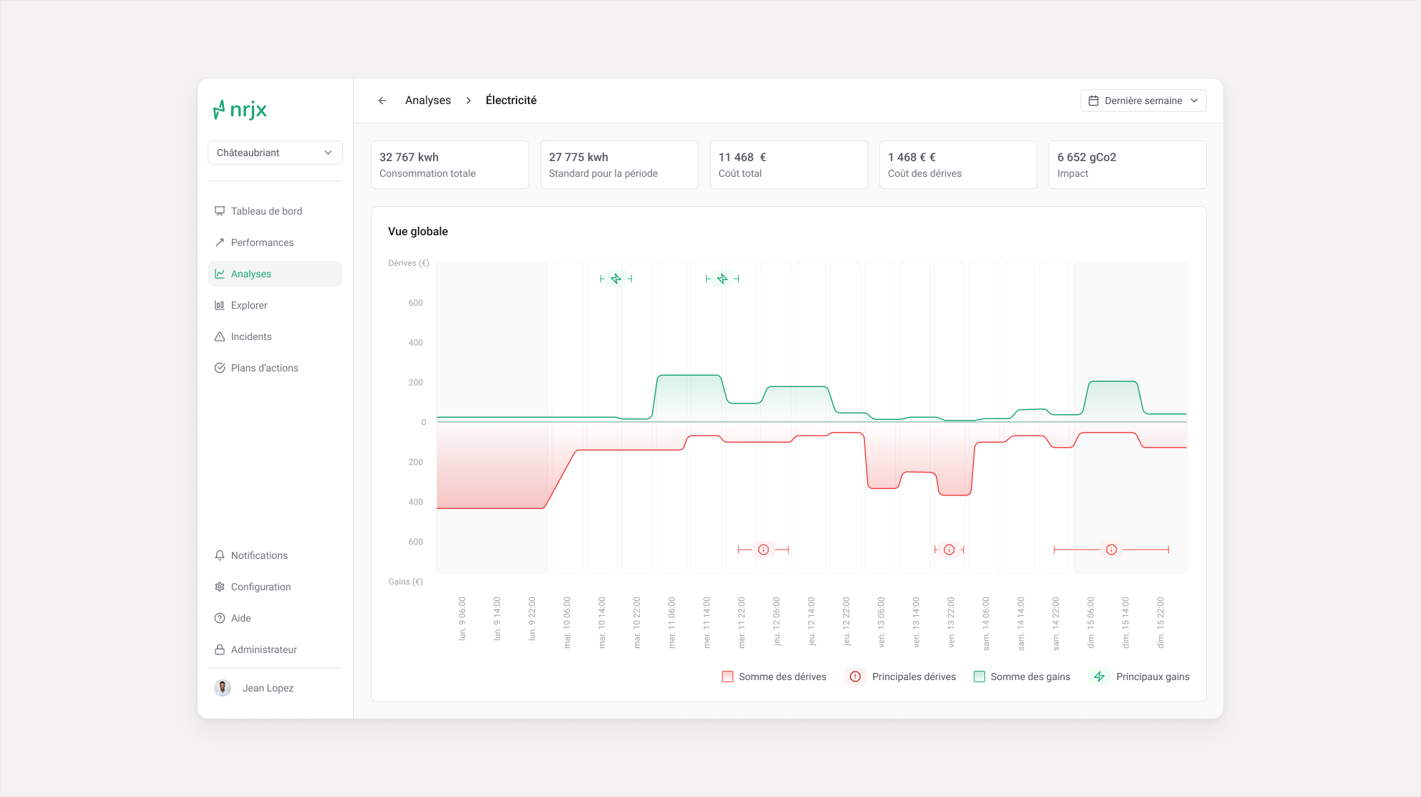
Concretely, every view shows three things together: the standard, the real consumption, and the deviations around it, positive (a real gain, worth spotting and repeating) as well as negative.
The standard is the load-bearing piece. It's a baseline finely parameterized on the site's own history: machine used, materials, time period, temperature. On top of it I designed a second layer I never saw built, a theoretical optimum drawn across clients, so that what NRJx learns on one site surfaces problems on every other one.
Design
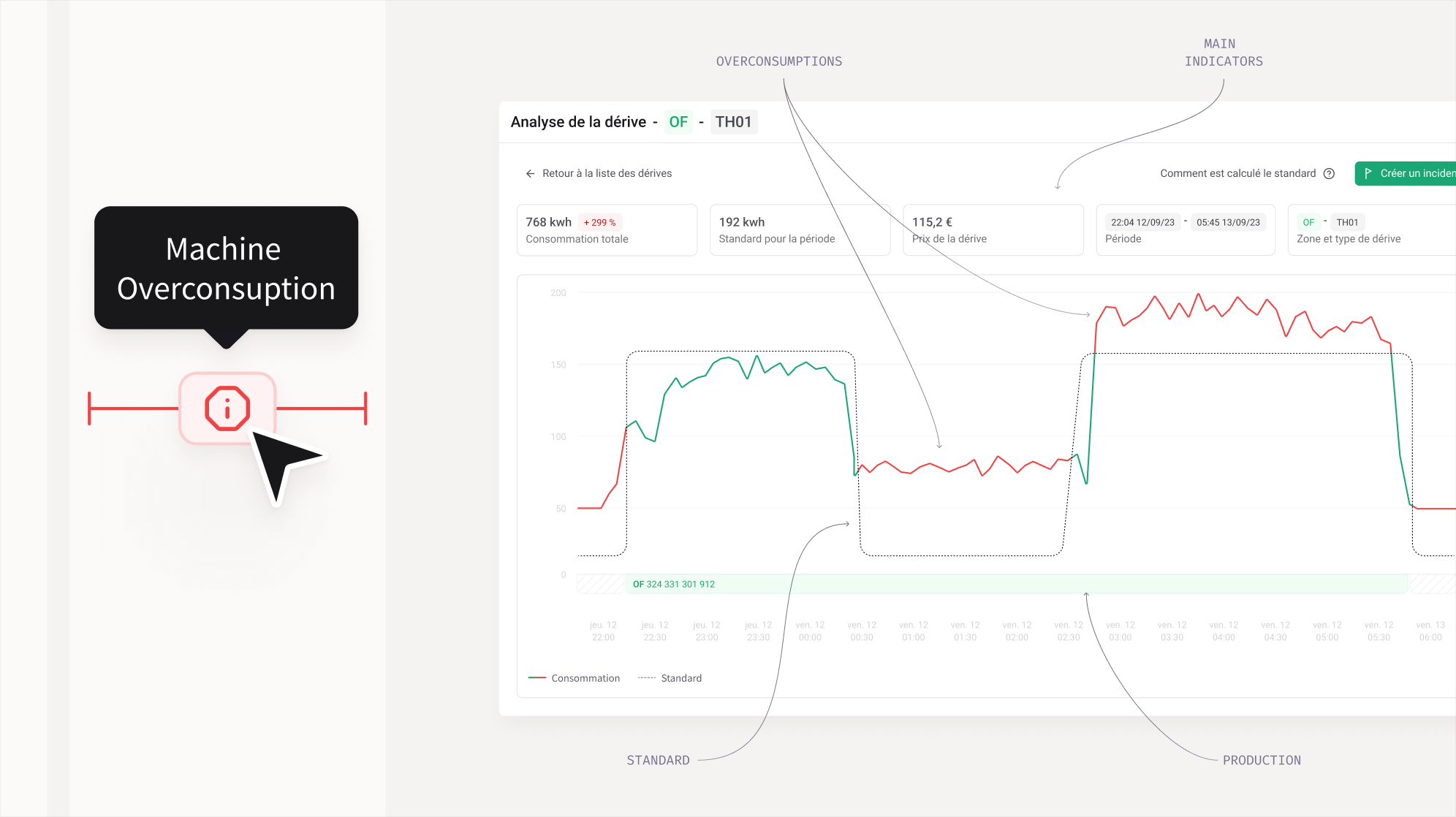
For the generalist, deviations surface as pills that catch the eye, the extreme ones get notified. The message is blunt on purpose: here, you have something to do. Clicking on it opens a modal with the details of this precise deviation.
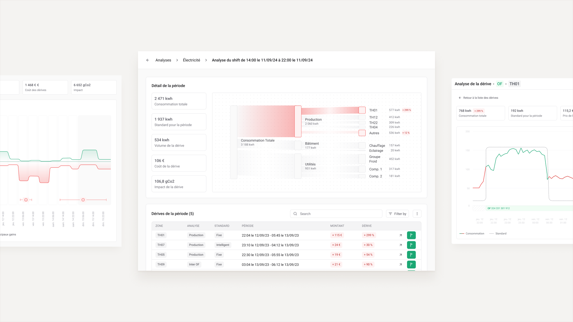
For the specialist, a deviation isn't a point, it's a stretch of time, and to understand it you need to know what was running during that stretch. That's why the graph is cut vertically into periods the user can click into. A period opens a broader view with the consumption of the factory in a Sankey. Each deviation is represented in a table under the Sankey.
Both users live in the same view. The generalist skips the Sankey and lands directly on the deviations, while the specialist clicks on a period to see the Sankey and understands the deviations as a whole.
Testing
I tested the prototype after the fact, with both personas. The useful surprise was on the generalist side: given access to the full depth, the non-expert didn't panic and stay on the surface. Because he got what he needed first, without noise, he was then willing to go down into the expert layer on his own.

What happened, and what I learned
My contract ended before the feature shipped, so I never saw it in use. This is what NRJx sells today: deviations flagged as they appear, alerts on the gap to an optimal consumption, energy data crossed with production and degree-days, and actions priced in kWh, CO₂ and euros. They now advertise 15% of energy savings.
First: actionability doesn't come from showing more data, it comes from choosing the user's real question and anchoring everything to it. Once "am I making or losing money?" was the frame, the design almost fell out on its own: the standard, the deviations, the two layers all followed. What stayed hard wasn't the design, it was technical: feeding the right data into that standard. I take that as a good sign. When the framing is right, the design goes quiet and the difficulty moves to where it belongs, the data.
Second, from the test: making a tool legible to a non-expert isn't about hiding the complexity from them, it's about sequencing it. Give someone their answer first, cleanly, and they'll choose to go deeper. That's the opposite of dumbing down, and it's the instinct I bring to any dense, technical product.